The Lyme Maze Game

|
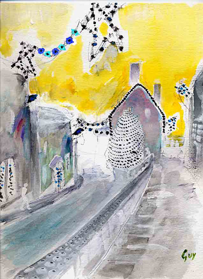
(Hover on and off this picture.) The story was that Tilly and I set out to see a movie at the cinema. But I had delayed and made us late and we found the movie had begun, and it was a movie notable for its opening scene (The French Lieutenant's Woman), and she was justifiably angry with me and didn't want to go in. But light arose from darkness: as we went back down the street I conceived the answer to—well, the story actually has two other starts: —One was that it was getting near Christmas, and I had left it almost too late to make a Christmas card to send to our friends, and hadn't thought of an idea. —Another was that, using the complex computer software called Adobe Photoshop, I had sometimes when intending to press "alt-I" pressed "control-I" and discovered that this reversed the whole image to its complementary colors. Actually Adobe calls it "inverting"; but years earlier, when I used to have to prepare pages for printing by paste-up on paper, I had learned about the technique printers called "reversing", by which a black drawing on white becomes white on black. (The first time I did this was for the cover picture of my first Astronomical Calendar, showing the figure of Orion rising.) And so I suddenly thought—actually, I had already thought of it as we hurried up the street—of drawing this night scene by just making a few black dots—instead of a mass of black paint—and then applying the transformation. Tilly consented to wait in the cold while I jotted some dots on a sketchpad. At home I also washed on some thin yellow, the sky above the dazzle of lights having been a deep bluish black; and I scanned it and pressed control-I, and we laughed with pleasure at the result. It wasn't quite as simple as that (because of the areas of other tones) and people earlier on the Christmas card list received versions that were of earlier "states", as we would say of an etching; indeed the tinkering with an image in Photoshop and reprinting it is a digital-age reincarnation of the old processes of printmaking. I found I couldn't produce a bright red—none of my pigments gave the complementary cyan—but I suspected I could paint a small area red and select it and reverse it separately; and yes, that worked too. Whether called reversing or inverting or "negative", as in photography, the effect is of a color being replaced by its opposite: white by black, blue by yellow, red by cyan, green by magenta, and vice versa to all those. A white substance is what reflects (or scatters or emits) every kind of light, black is what sends out (ideally) none. A blue substance is what absorbs most of the green and red wavelengths, releasing almost-only the blue; green absorbs blue and red, releasing almost-only the green; red absorbs green and blue, releasing almost-only the red. Yellow absorbs most of the blue, releasing most of the green and red; magenta absorbs green, releasing blue and red; cyan absorbs red, releasing blue and green. And a darker yellow (reflecting less) will when reversed make a lighter blue.
The bottom half of this image was made by just reversing the top half. Blue, green, and red are the parts of the spectrum of light to which the three kinds of cones in the retinas of human eyes are most sensitive. If you mix them (with a machine that shines the three beams onto one surface) you get the impression of white light, so they are called the "primary additive colors". Cyan and yellow, and other intermediate colors such as orange, also appear in the spectrum, because these sensations can be produced by wavelengths in between the peaks of blue, green, and red, as well as by mixtures of those peaks. But magenta, being produced by the mixture of non-neighboring spectral colors, appears nowhere in the spectrum. If you stare for a while at something blue, then look away at a white wall, you see a yellow patch: the blue-receptive cones have temporarily tired and are being outcompeted by the green and red ones. I think I have all this approximately right. To try to paint in opposite colors, with a view to reversing them to the intended colors, is the interesting mental exercise of trying to keep all this in mind. But the black-and-white part of it is much easier. To draw or paint a dark scene normally you have to brush on loads of dark ink or paint (obscuring any preliminary drawing you may have made) and then apply the light details over, or you could start from canvas prepared with a dark ground. But reversing allows you to apply the minimum of marking instead of the maximum. The fewer the stars, the darker the night. This easy way to a mostly-dark picture is not Van Gogh's "Starry Night", and he would despise it—or would he? I don't think he would have disdained to play with a newly offered means. Oil paints themselves, and acrylic paints in their turn, were once an unfairly modern cheat. |

